The Art of Color Combinations: Colors are known to add the right mood, temperature, and structure to your work or projects. If you have a sensitive soul, the impact of a perfect color combination will feel deeper and more intensely moving to you. Colors are a powerful communication tool that can be used to signal action, influence mood, and even affect physiological reactions. It is indeed true that certain colors are associated with increased blood pressure, heightened metabolism, and eyestrain. However, in general, color can influence our perspective on various things, and so can the combination of colors.
The Art Of Color Combinations is paramount when it comes to visual design projects. Apart from that, the importance of selecting colors for a brand or a company has always led to confusion. It’s quite understandable because once a brand decides on a color pattern for its company, it’s unlikely to change it in the future. This is why it is essential to spend considerable time choosing your color palette. The right kind of color combination will represent your brand in the future, so always keep that factor in mind. While considering this, you must choose a color combination that suits your brand type and appeals to the majority of the audience.
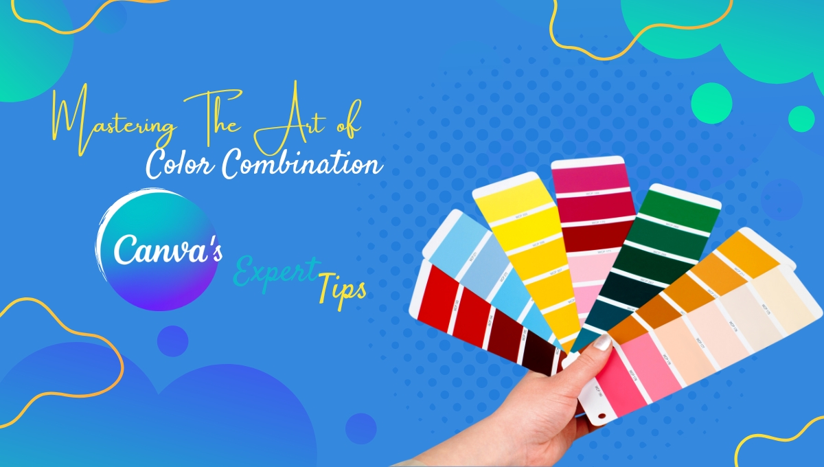
Best Tips To Learn The Art Of Color Combinations By Canva
Canva believes that when it comes to design, mastering the art of color combinations can be challenging, yet crucial for creating eye-catching visuals. The right color combination can make designs look vibrant, aesthetically pleasing, and capable of attracting attention while influencing our emotions and thoughts.
Whether you are designing a poster, logo, or business card, it is essential to recognize the significance of the art of color combinations in enhancing the overall impact. Canva offers 100 inspiring color combinations inspired by nature, food and drink, travel, and other everyday items. But before delving into those, let’s shed light on the fundamental color combinations most commonly used by designers.
Different Types Of Color Combinations
It is already known that different color combinations can evoke different moods or tones. You can just do that by using color theory and color psychology. Here are some of the most popular types of color combinations that are commonly used.
1. Complementary Color Combinations
If you are interested in choosing complementary colors, then you should know that they sit opposite each other on the color circle. Along with that, complementary colors also evoke feelings of energy and vitality, not just for you but also for the viewers.
2. Triadic Color Combinations
The art of color combinations, which is Triadic, utilizes three colors positioned equidistantly on the color circle, forming a triangular shape. By employing this type of color combination, one can evoke a sense of peace and harmony in the eyes of the viewer of your design.
3. Analogous Color Combinations
In analogous color combinations, you will see a combination of 2 or 5 colors. They sit adjacent to each other on the color circle, creating a smooth and pacifying feeling for the viewer and the designers who often opt to choose hues that are slightly muted within these combinations.
4. Tetradic Color Combinations
The Art of Color Combinations: This type of tetradic color combination scheme involves one primary and two complementary colors, along with one additional color that highlights accents. In this color combination scheme, all four colors are distributed evenly around the color wheel, resulting in no clear dominance of one color.
What Canva Suggests?
If you are looking for the art of color combinations for a nature-based product or advertisement, then you should definitely go for fresh and bright colors. Utilize Canva’s color palette features to make your design pop.
-Red suggests confidence and power, while blue implies calmness and trustworthiness. These kinds of colors work exceptionally well in any corporate context and are commonly used in the service sector.
-Additionally, if you seek a dramatic contrast, look no further than the shades of plum and reddish-orange. They exude artistry and, let’s face it, they also look super aesthetic.
-For crisp and dramatic shades, opt for warm and greyish undertones of cooler greens.
-If you happen to choose cool blues, they are bound to create a monochromatic effect.
Visit Canva’s website to access the mentioned templates when designing a business card, advertisement, or other creative projects.
How Can Canva Help You With Color Combinations?
You can now access about 100 color combinations with Canva and learn how to apply them to your designs. If you are interested in mastering the art of color combinations and want to know how to implement them in your designs, visit the Canva website to find out more.
