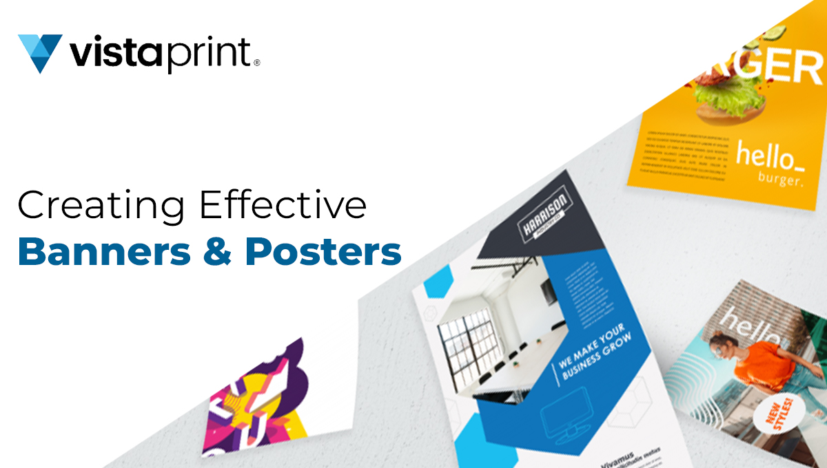
Posters and banners are powerful tools for conveying messages, promoting events, and grabbing people’s attention. Whether you’re designing a poster for a local charity event or a banner for your business, creating visually appealing and effective designs is crucial. These are very important to make sure that the things that are required reach the many people who are crossing over to the particular place. This is an amazing way to reach the audience and give them knowledge and information related to many things.
Know Your Audience
Understanding your target audience is the first step in developing a great poster or banner. Knowing who you are trying to target will allow you to adjust your design and messaging accordingly. Take into account characteristics such as age, gender, pursuits, and preferences. You cannot develop what your followers are seeking if you don’t know who they are.
Define Your Purpose
Every poster or banner should have a clear and specific purpose. Are you promoting an event, announcing a sale, sharing information, or raising awareness? Define your purpose before you start designing, as it will guide the entire creative process and help you prioritize the most critical elements.
Keep It Simple
One of the most common mistakes in poster and banner design is cluttering the layout with too much information or visual elements. Keep It Simple, Stupid—this is a maxim you should always follow. A clean and uncluttered design is more likely to grab the viewer’s attention and convey your message effectively.
Choose the Right Colors
Color plays a significant role in design. Different colors evoke different emotions and associations, so it’s essential to choose colors that align with your message and brand. Use a color scheme that complements your content and ensures readability. High-contrast color combinations can make your text and graphics stand out, but be cautious not to overdo it and create visual discomfort.
Typography Matters
The choice of fonts and typography can greatly impact the readability and overall look of your poster or banner. Avoid using too many different fonts and stick to a maximum of two or three complimentary typefaces. Ensure that your text is easy to read from a distance, and consider using bold or larger fonts for headlines to make them pop.
Create a Focal Point
Every poster and banner should have a clear focal point. This is the element that draws the viewer’s attention and communicates the primary message. It could be a striking image, a catchy headline, or a central graphic. Make sure your focal point stands out and guides the viewer’s eye to the essential information.
Use High-Quality Images
If your poster or banner includes images, make sure they are of high quality and resolution. Your design can look unprofessional if the images are blurry or pixelated. Invest in high-resolution photos or use vector graphics for the best results. Images should also be relevant to your message and enhance the overall visual appeal.
Balance and Symmetry
Achieving visual balance and symmetry in your design is essential for creating a pleasing composition. Balance doesn’t necessarily mean everything must be perfectly symmetrical; it’s about distributing elements evenly to create a sense of equilibrium. Experiment with different layouts and placements to find the right balance for your poster or banner.
Pay Attention to Size and Scale
Consider the size and scale of your billboard or banner, as they will impact its visibility and effectiveness. However, similar to a billboard, you will need a larger textbook and plates to ensure readability from a distance If your design will be displayed in a large outdoor format. On the other hand, lower formats like pamphlets or social media banners bear more terse and focused designs.
Include a Call to Action (CTA)
Still, similar to attending an event or making a purchase, include a clear and compelling call to action( CTA) If your billboard or banner is intended to motivate people to take action. Your CTA should be terse, action-oriented, and stand out from the rest of the content.
Proofread and Edit
Before sending your design to print or publishing it online, carefully proofread all text for spelling and grammatical errors. Typos can undermine the professionalism of your poster or banner. As the sizes of both the poster and the banners are different, it is still important to check for all the errors before showing them to the public.
Stay Updated with Trends
Design trends evolve over time, so it’s essential to stay updated with the latest developments in design. While classic design principles remain important, incorporating modern trends can make your posters and banners feel fresh and relevant.
Conclusion
Designing effective bills and banners requires a thoughtful approach that combines creativity with practicality. You can create eye-catching designs that effectively express your message and leave a lasting impact by knowing your cult, establishing your objective, and following these ideas and methods. A well-designed billboard or banner may make all the difference in capturing the attention of your target audience, whether you are advertising an event, flashing your brand, or raising awareness for a cause.

